Page zoom and CSS typography
With most browsers now using Page Zoom rather than just enlarging text is this the end of the road for em based typography?
Em based typography 
Em based typography is a concept I discovered through Richard Rutter and his excellent article How to size text using ems and the 24 Ways article Compose to a Vertical Rythmn. I began to use em based typography in my CSS work and recognised that giving the eye a vertical hierarchy is as important as vertical grids.
I discovered that using ems to set up typography is more time consuming and more difficult to maintain. When a client asks to increase padding, you can end up having to revisit all of your typographic CSS rules and return to the calculator to run through numbers running to ten decimal places. But the effort is well worth it. I began to notice sites that used vertical rhythms and they all seemed more usable and intuative. Typesetting on the web is an underestimated craft and for me the results were worth the additional effort of using ems.
Zooming in 

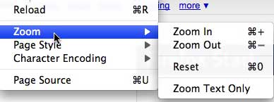
Fast forward a couple of years and browsers now use Zoom view as the default way of enlarging a site. It was Dave Shea’s article that got me thinking about this. Dave notes that in all but Safari browsers now use zoom and not the older method of resizing the text. He notes that the responsibility for how a site appears is now in the hands of the browser and not the designer. One of the main reasons for using em based typography is to ensure that a vertical rhythm is not broken when the text is resized. The Zoom view removes that requirement as the browser enlarges the entire page rather than just the text.
The end of ems? 
So will I be returning to using pixels to set up vertical spacing and rhythm. The answer is a resounding no!
My reasoning is that using ems for typography in my opinion helps designers to see the vertical rhythm of a page as a coherent whole. You can smash typography with the pickaxe of pixels but elements are then their own entities with no relationship to others. Ultimately my decision is with the user in mind. My opinion is that it is quicker for users to learn and consume layouts if there is a consistent vertical rhythm. The best way to achieve that is to use ems. So even though page zoom takes the technical aspect out of the equation I still consider from a usability perspective that vertical rhythm is extremely important.
Tags
Can you help make this article better? You can edit it here and send me a pull request.
See Also
-
UK Government standards draft needs rethinking
The UK Govenrnment's Central Office of Information has published a <a href="http://www.coi.gov.uk/documents/guidance/browser-standards-draft-v0-13.pdf">Browser Standards Draft</a> suggesting browser support should be based on usage. The draft document has misinterpreted the browser market and needs to be reconsidered. -
Google Chrome - no pulse racing but it is fast
Last week Google launched a new web browser Google Chrome. Built to facilitate the next generation of web applications the browser is an exciting newcomer to the market that wins on performance and features but looks like 'my first web browser'. -
IE6 not going anywhere soon
I've been monitoring browser statistics on clients over the last few months in order to understand the effects of the IE7 forced update by Microsoft. Among corporate clients it doesn't seem to have had much effect and IE6 looks set to be around for a while.