Mobile sites are more than mini-mes
Mobile versions of websites can be better than their bigger, richer web versions. Moreover user-focussed, task-driven mobile sites can inform and improve their bigger brothers.
Task-driven on steroids 
Mobile sites force designers to think more carefully about creating task-driven sites than otherwise. The space available to work with is minimal. The width of the screen can be anything between 150 and 320 pixels wide. This is significantly less than lowest resolution monitor. Furthermore the ratio of x to y on the screen is the inverse of a traditional screen. We are working with landscape rather than portrait.
From a design perspective this presents a number of challenges. User actions have to be presented first and at times navigation goes out the window.
I have been browsing the web with handheld devices for around three years and to start with it was clear that designers did not understand the limitations of the environment. In fact I would say that large content sites like CNN and BBC still struggle to get navigation and relevant content on a mobile screen.
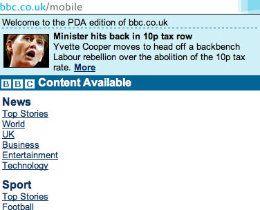
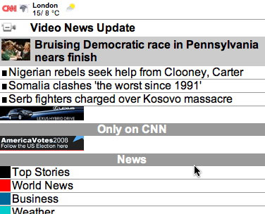
Social networks succeeding 
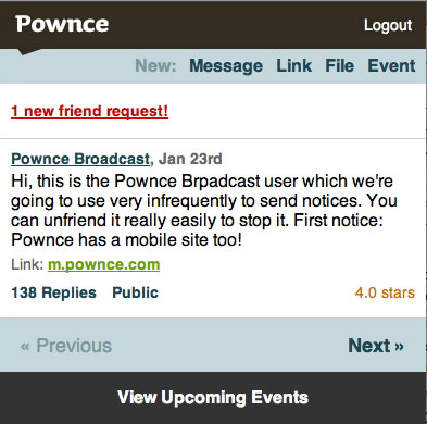
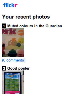
For me social networking sites are succeeding where large content sites are not. They have the enviable advantage of having a limited number of tasks that users can perform. Still though they are getting tasks onto the page quickly and in a usable manner. Here are a few examples:
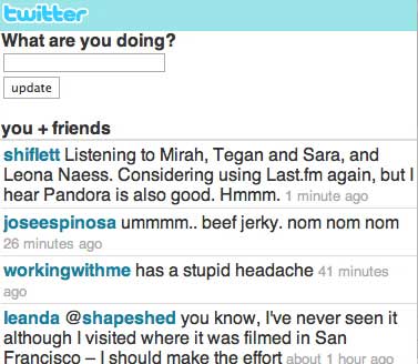
Mobile design is sometimes better 
I’m going to say something controversial. In some cases I prefer mobile versions to the full web version. If we take Twitter I tend to access m.twitter.com rather than the full site even with a full browser. There are several reasons for this:
- The page loads more quickly
- The tasks I want to perform are available more quickly
- I can perform everything I want to on the mobile version
- I get the job done more quickly
Design theory has made great strides in focussing on making a site user-focussed and task-driven. Mobile sites represent the ultimate incarnation of that. Increasingly I’m feeling that stripping a site back to its bare bones can help to understand the product better and can inform the full web version and sometimes even usurp it.
Tags
Can you help make this article better? You can edit it here and send me a pull request.
See Also
-
Leopard OSX's UI Design
Leopard, Apple's latest version of the the OSX operating system was released last Friday. In my opinion some of the interface changes are a step backwards. -
The New Photoshop Logo
I'm not often moved to criticise other designers work. It is their livelihood after all. But the new Photoshop logo falls well short of the mark. -
Bored by Web 2.0 Design
Glossy buttons, reflective logos and beta buttons are everywhere. Designers have become magpies taking anything shiny and using it without thinking whether it makes a website better.