Leopard OSX's UI Design
Leopard, Apple's latest version of the the OSX operating system was released last Friday. In my opinion some of the interface changes are a step backwards.
Folders! 
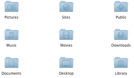
For me the folder design is a real step backward. I’m not averse to change but I feel that the Leopard folders just don’t work for what they need to do. Surely the brief of the icon design is that common folders should be quickly recognisable and different.
In Tiger the colours are clearly different and it is simple to differentiate which folder is which.
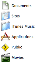
In Leopard we have moved to a monochrome blue that makes it hard to differentiate. Granted it is a new OS but I find I am taking longer to work through my folder structure.
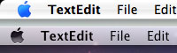
Translucent menu bar 
This is another item I think Apple have just got plain wrong. The menu bar is an important focal point of user action. Making it semi opaque lowers the impact and actually makes it harder to read. See what you think. Tiger on top Leopard below.
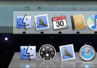
The dock 
Much has been made of the reflective dock and how windows coming near the dock reflect. I feel I should be going wow but I’m not. This is a feature I just can’t get excited about! Again Tiger on top Leopard below.
No problems under the hood 
This is more of a whinge (I’m English after all) than a serious objection. I’m very pleased to have the latest versions of Apache and PHP pre-installed as well as Ruby on Rails. The fact it is now formally UNIX compliant is great news too. It supports a dazzling array of protocols for both Windows and Linux too. If Leopard is as rock solid as Tiger has been for me then these small UI gripes won’t matter a bean.
A blip? 
Apple have been so successful as they have produced designs that are user-focussed and simple to use. My concern is that the Leopard UI shows problems that should easily be picked up in user testing. Which folder icons do you find easier to use? I suspect Tiger would win every time. Which menu bar is easier to read? Again Tiger for me is better. Do you really care about the shiney dock? Not really no - I just want something that is easy to use.
Tags
Can you help make this article better? You can edit it here and send me a pull request.
See Also
-
IE7 one year on
Today is the launch of Leopard, Apple's latest version of the OSX operating system. With it comes Safari 3, a product that almost a year on from the launch of Vista highlights the stagnant performance of Internet Explorer 7. -
The New Photoshop Logo
I'm not often moved to criticise other designers work. It is their livelihood after all. But the new Photoshop logo falls well short of the mark. -
Bored by Web 2.0 Design
Glossy buttons, reflective logos and beta buttons are everywhere. Designers have become magpies taking anything shiny and using it without thinking whether it makes a website better.