Designing with grids in Photoshop
Creating a grid to base your designs on is invaluable for giving structure to the page. Here's a quick introduction to grids and how you can speed up creating them in Photoshop.
Learning from newspapers 
Newspapers bear many differences to designing online. They are held in the hand, the print size is fixed and you can see the whole page at once. But they also bear many similarities. They are portrait, generally have a header and present large amounts of content in a small space. The skills of the designer here is to get as much as possible into the page without making it appear cramped.
How then is this achieved? Of course there is a large amount of creative flair but underpinning all of this is generally a grid. If you look at any modern newspaper you will see a grid behind the layout. Here’s an example from the UK paper The Guardian.
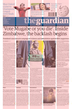
The layout has five columns and content is arranged around this grid to give the page structure but also to highlight more important pieces of content. The headline for example spans all five columns which has the effect of dominating the layout. This of course is exactly what is intended. In this particular example the content is tightly aligned to the grid. Grids can also be used to break rhythm. In this example the footballer in the header breaks outside the expect columns. This is a design effect that is used to draw the eye to a feature.
Once you understand grids you will start to see them everywhere. They are on poster designs, TV graphics, identity design, product design, in fact pretty much everywhere.
Applying it to the web 
Basing your design on a grid has many advantages from giving structure to the page to allowing users to learn the layout quickly. How though do you go about setting up a grid in Photoshop?
Here comes the maths. If you are designing to a fixed width design you need to decide how many columns your design is going to have and how much spacing you want between them. So say for example we are designing to a width of 1000px we need to work out how wide our columns are and the spacing between them. We are going to stick with a 5 column design here so our columns will be 180px with a spacing of 10px on either side. If you are designing to a fluid width you will need to pick a width to do your design in Photoshop. 1000px is not a bad idea as then you can convert your spacing to percentages by removing a zero.
Using patterns 
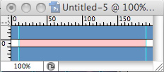
Photoshop’s ability to create custom patterns is perfect for this job. First let’s create a column so we can apply it to a larger canvas. Create a new document of 200px x 10px. The height here isn’t really important. Then set some rulers 10px in from each side and draw a rectangle of 180px using #ff9999 as the colour. It should look like this:
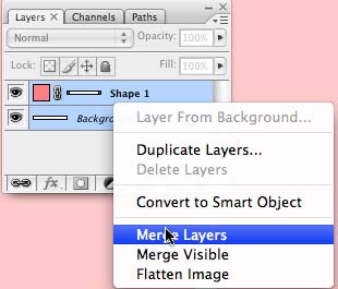
Next we need to merge the layers so we can use the pattern. In the layers palette (F7) highlight the two layers (hold down shift and click), then right click and choose merge layers. This merges the layers into one.
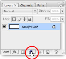
Now go to Edit > Define Pattern. Give your pattern a name and click ok. This saves the pattern so we can use it in future. Now create a new document of 1000px x 700px. Bring up the Layers palette and click on the New Fill or Adjustment Layer icon at the bottom:
From the menu choose Pattern… Then select the pattern that we have just created. If your maths and shape sizes are correct you will now see a perfect grid across your design. This is one layer so you can use it to create your design and change the visibility or opacity as you wish. Job done!

Tags
Can you help make this article better? You can edit it here and send me a pull request.
See Also
-
Creating backgrounds with Patterns in Photoshop
Often designs need a background to fill space behind navigation or other page elements. Here one way to create them. -
Using patterns in Photoshop
Patterns area hidden gem in Photoshop. Here's a short tutorial showing you how to make your own and how to use them in your designs. -
The New Photoshop Logo
I'm not often moved to criticise other designers work. It is their livelihood after all. But the new Photoshop logo falls well short of the mark.