Typography for the Web
Until recently typography on the web has been overlooked. This article discusses issues to consider and some of the techniques available to create strong typography.
Why not just use images? 
You can of course use any font your would like to if you use images. The problem with this approach is that it isn’t best practice. Using an image is less accessible, it isn’t as friendly to search engines and it can lead to increased maintenance costs.
Working with a limited set 
So what are your options? Firstly it is important to understand that for a font to be viewed on a client machine it needs to be installed on that machine. If you use Frutiger on your site but the user doesn’t have it locally it won’t be seen. Familiarize yourself with the common fonts on Windows and Mac. You may be surprised that there are not many fonts available. Sadly this is unlikely to change for the near future.
Serif or Sans Serif? 
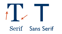
The difference between Serif and Sans Serif fonts is that Serif fonts have edges that stick out, whereas San Serif are smooth. Have a look at the image below to see the difference. Generally North Americans favour Serif fonts, whilst Europeans favour Sans Serif. There is no right or wrong - it is more a question of style. Personally I think Serif fonts work well for headings with Sans Serif used as body text.

Anti aliasing in browsers and operating systems 
Display issues are not just limited to whether a user has a font on the local machine. It also depends on what that machine is. You will notice that fonts display very differently on Windows to Macs. This is because Macs turn on anti-aliasing by default. This means that edges are smoothed resulting in a crisper display. For Windows machines this isn’t the case resulting in ragged edges to the font. There is not a great deal you can do about this, although thankfully Internet Explorer 7 has anti-aliasing turned on by default.
Controlling font size and appearance 
Cascading Style Sheets offer designers a great deal of control over the appearance of fonts. My preference is Richard Rutter’s approach to sizing font-size using ems. This allows designers to control font size, whilst allowing the user to resize the font if they wish. There are a large number of options to styling type with CSS - a few of them are explored in this article.
The most important one is the font declaration. Using this you can specify the size and font to be used. You can also specify which font should be used if that particular font is not available. [code] font: 62.5%/1.5 “Lucida Grande”, “Lucida Sans”, Tahoma, Verdana, sans-serif; [/code]
In this example the font size is rebased to 10pt at the default sizing. The first font used will be Lucida Grande, then Lucida Sans and so on.
Pushing the limts 
Several innovative techniques have emerged that are now mature and widely used. Firstly Image Replacement is a viable option to allow styling of Headings for example. You create an image and then replace the text with the image of your choice. There are Accessibility concerns with image replacement - you can read about it and the techniques available to you over at Doug Bowman’s site.
SiFR is another technique that uses Flash and Javascript to replace text with a Flash File. This allows designers to use any font they want. This method is search engine friendly and degrades well. It will involve a little more development time if you have never used it before but it is well worth a try.
Keeping things in perspective 
Typography on the web is in its infancy. Whilst new techniques are springing up all the time it is important to remember that text is there to communicate. This should be the primary function of typography. The real skill of typographic design is combining readability with a pleasing aesthetic. I find viewing a page without images is a good way to find out if typography is doing its job. So go and explore and help make this new discipline!
Tags
Can you help make this article better? You can edit it here and send me a pull request.
See Also
-
Photoshop 101 - The Type Tool
Adding type to designs is a daily task in Photoshop. Especially if you are interested in Typography mastering this tool is a must. -
New fonts in Windows Vista
A tour of the new fonts in Windows Vista. We can use more fonts! -
My web typography is awful
Inpired by Robert Bringhurst's "Elements of Typographic Style" I decided to explore the typographic capabilities of CSS further. What I found was that browser support is much better than thought and that my own approach to Typography is woefully lacking.