The New Photoshop Logo
I'm not often moved to criticise other designers work. It is their livelihood after all. But the new Photoshop logo falls well short of the mark.
Another Photoshop Logo! 
Adobe has just given Photoshop another new identity. Granted it every designer’s disease that they are continually tweaking with their own product. It is inevitable. The new identity for the Photoshop family comes just months after Adobe Creative Suite CS3 was released. Veerle posted a good article about that branding exercise and summed it up pretty well.
I didn’t have a “whoa!” reaction myself the first time but it grows on you.
Sadly the Periodic table, as it came to be known, hasn’t grown on me just yet.
The new logo 

Here’s the new Photoshop logo. I don’t have that “whoa!” reaction myself. I’m not normally bothered by logos I do not like but this provoked a strong reaction. I’ve tried to think rationally why.
Web 2.0 diluted 
The logo goes for every Web 2.0 cliche possible. Rounded font, glossy surface and the use of potentially thousands of colours that will be difficult to replicate in a print environment without very high quality printers. How will it look in a newspaper for example? Aesthetically for me it lacks imagination and is trying too hard to be trendy.
No relation between elements 
The three elements are not joined in any way. The logo floats to the left, Photoshop hangs to the right and the tagline (why?) drops off the bottom. It terms of Graphic design discipline it doesn’t follow any discipline.
Design != Use 
If the logo is to replace the icon (I don’t know it will) then the logo is pretty much unusable in a Macintosh environment. Mac logos need to be higher than they are wide. If you are Mac user look at any icon in your toolbar. Mail, iCal any of them. It is a design requirement that they are higher than they are wide, or at least square. The new Photoshop logo is the opposite and is going to be difficult to use in the icon tray. Let’s hope I’m wrong.
I love Photoshop 
I think the reason I have such a strong reaction is that Photoshop is something I use on a daily basis. I click the icon at least once a day. It is part of my life. It provides me with a living and I love what it can do. The prospect of having to look at this logo until it is replaced doesn’t fill me with joy. Quite the contrary - it fill me with irritation.
An impossible job 

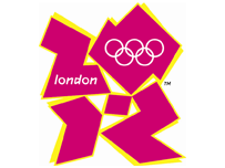
Admittedly designing a logo for Photoshop is difficult. It will be exposed to pretty much every professional designer around the world. Every designer will have an opinion. But this logo has got such a universal bad reaction that it seems we have got another London Olympics logo on our hands. Part of me wonders whether this is just a big practical joke or are the Emperor’s new clothes really back in fashion? Or should I just put my slippers on and relax?
Tags
Can you help make this article better? You can edit it here and send me a pull request.
See Also
-
Dotted lines in Photoshop
Designing for the web in Photoshop has one thing missing - dotted lines. Here's how to create dotted lines so you can show clients how links will look. -
Improving image quality in Photoshop
Often clients deliver images that are not really good enough for use on the web. Photoshop comes with some less well known features that can improve image quality drastically in a couple of clicks. -
Creating grunge effects in Photoshop
Designing with grids is commonplace in design but the danger is that everything looks a bit ordered. Using grunge effects you can keep your grid and mess up your hair to look a bit cooler.