New fonts in Windows Vista
A tour of the new fonts in Windows Vista. We can use more fonts!
Here they are:
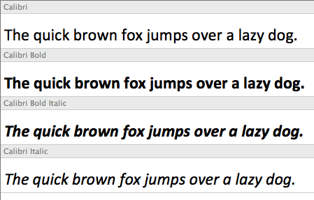
Calibri 
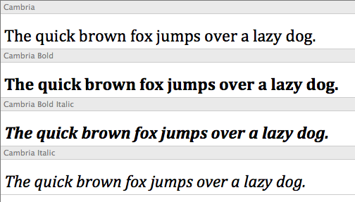
Cambria 
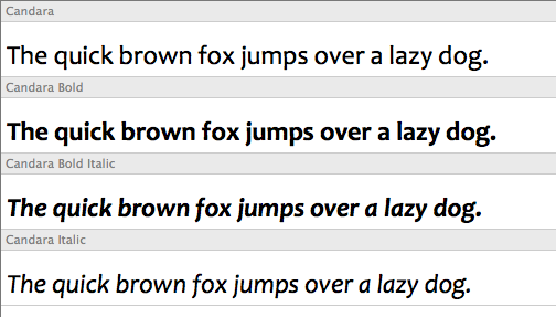
Candara 
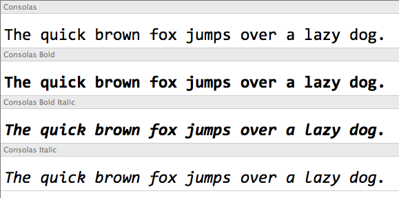
Consolas 
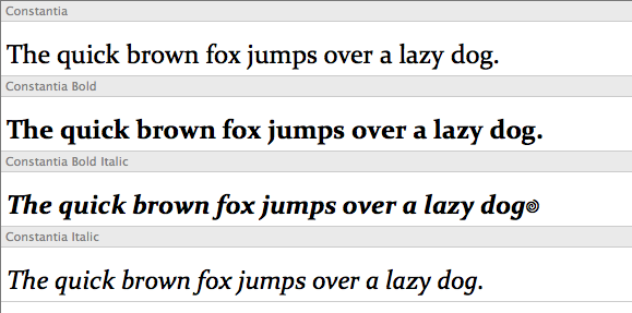
Constantia 
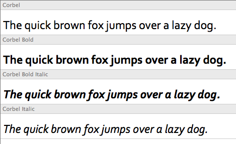
Corbel 
Segoe UI 

You can degrade your font choice gracefully using CSS so that if a user is on Vista they will get the new font but if they are not they will get another one.
In this example if the user does not have Corbel they get Lucida Sans. If they don’t have Lucida Sans they will get Verdana and so on.
font: 62.5%/1.5 “Candara”, “Lucida Sans”, Verdana, Tahoma, sans-serif;
With such a limited choice of system fonts this is something for typography fans to cheer about (well a little bit!).
Tags
Can you help make this article better? You can edit it here and send me a pull request.
See Also
-
My web typography is awful
Inpired by Robert Bringhurst's "Elements of Typographic Style" I decided to explore the typographic capabilities of CSS further. What I found was that browser support is much better than thought and that my own approach to Typography is woefully lacking. -
Controlling font size using CSS
CSS offers designers a great deal of control over text and has good browser support. Many web designers overlook Typography, a crucial element of design. This article looks at a best practice method for controlling font size on your website. -
Windows Vista and XP Dual Boot
Today I successfully completed a dual installation of Windows XP and Windows Vista Beta. I've now got a PC that will boot to either operating system. This is great for being able to test things on either platform with a variety of browsers.