10 Tips For Print Designers Coming To The Web
More and more print designers are making the switch to the web which is breathing life and creativity into designs around the web. Often however print designers are unaware that the medium is very different from the print environment. Here are ten tips to get your design for the web on the right track.
Meet pixels 
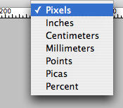
The primary unit of designing for the web is Pixels. Particularly when you are setting up your page you will need to be aware of pixels. When creating a new document Photoshop allows you to select a number of predefined page sizes for the web. It is a good idea to have rulers switched on so you can see pixel widths. To view rulers go to View > Rulers. It is possible that the default unit is not pixels. Right click on one of the rulers to bring up a menu and select pixels.
Screen size is not uniform 
Screen sizes or viewports are not uniform on the web. Most users will have screens of at least 1024 x 768 pixels, although to be absolutely safe you should design for 800 x 600. Often screens are slightly smaller so it is a good idea to bring designs in 10 pixels from the default.
Fixed width and Fluid width 
You may decide that you want your design to stretch with the size of the viewport. The advantages of this are that the entire width of the screen will be filled. The disadvantage is that your design will be pulled sideways on very wide screens. This is very much a matter of personal preference. Compare a fixed width design like the BBC to a fluid design like Slashdot. It is a compromise between filling the screen and maintaining control over your design.
If you are feeling really adventurous there is also elastic layout - see Jon Oxton’s article or this article on A List Apart.
Limited fonts 
In order for a font to display as text on the web it has to be on the users computer. There are ways to get round this but it is good practice to understand that there are limitations to the fonts you can use as text. Of course if you wish you can create text as images and use any font you like but this has some accessibility and search engine optimisation implications. Familirise yourself with the fonts that are available by default. There are two good surveys on installed fonts for Windows and for Mac. If a user does not have a font you can specify another one that should be used. A CSS coder can explain this to you in further detail.
Deliver designs as layered Photoshop files 
The Industry standard for delivering designs is a layered .psd Photoshop file. Keep everything seperate - that means background images, colours, and text. This will make coding the site quicker and easier. Leave text as text - do not convert to symbols as you would for print as this will hide the font type and size from the coder.
Don’t expect your design to look the same on all browsers 
Possibly the most difficult thing to accept for print designers is that they have less control over designs on the web. Users are able to alter designs by enlarging text, turning off styling or images. Furthermore browsers interpret code differently so your design may appear slightly differently on Opera than it does on Internet Explorer. A good XTHML and CSS coder will be able to make it as close to the design as possible but beware that there may be some minor differences.
Be aware of Web Safe colours 
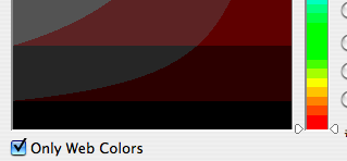
Computer screens are improving but there are still a significant number that are unable to display all colours. If you want to be certain that your design will display consistently across the web you need to use web safe colours. In Photoshop’s colour picker you can check ‘Web Safe Colors’. This will reduce the palette to colours that will display on the web. Yes it is limited! If you do not use web safe colours beware that the colour of your design may display inconsistently on some monitors.
Scrolling issues 
Vertical scrolling is normal but beware that particularly on the homepage your should have your most important page elements within the Viewport. The point at which the screen scrolls is called the fold. On 800 x 600 screens this is at 600px. At very least you should have your navigation and logo before the fold.
Horizontal scrolling is generally frowned on. Users are not used to this convention and it is not recommended so avoid this.
Take advantage the web for inspiration 
One of the great things about the web is that you can access any design. There are a number of style galleries you can browse and bookmark. If you are familiar with RSS you can subscribe to feeds from the major ones and have new designs delivered to your newsreader each day. A number of good ones are Stylegala, Netdiver, CSS Drive and CSS Elite.
Learn XHMTL and CSS 
Although you do not need to know XHTML and CSS to design for the web you will be giving yourself a strong advantage if you understand the medium your a designing for. There are some excellent books now on the market to introduce you to XTHML and CSS. Many designers have learnt XHTML and CSS - it is not difficult and your designs will be more robust and better informed as a result. A couple of recommended books are: Beginning CSS Web Development and Build Your Own Website the Right Way.
[![image][16]][16]
Tags
Can you help make this article better? You can edit it here and send me a pull request.
See Also
-
How To Get The Most From Your Homepage
A Homepage is like a shop window. It is invariably the most commonly visited page and if it does not draw customers or viewers in, it has failed. This paper looks at what makes a successful Hompeage. -
Branding and logos - from ideas to implementation
Getting branding right is a difficult process. Often both clients and designers fail to understand what each party needs or is looking for. This article seeks to give some advice on how to issue a brief and issues to consider for small to medium sized enterprises.