Overlapping tabbed navigation in CSS

A tutorial showing how overlapping tabbed navigation is possible in CSS and can be cross-browser compatible, accessible and javascript free.

Not interested in the explanation? You can find the demo and download the source code here.

Overlapping Navigation Example

Overlaps - a problem

Overlapping navigation is a real problem in CSS with the box model and browser support. It is possible though. This technique is advanced CSS and the tutorial assumes a good level of understanding of both CSS and XTHML.

Avoid it if possible

If you can avoid it you should. It will be time consuming to produce and difficult to maintain. If you really need it or are just keen to see it done in CSS read on!

Step 1 - Graphics

Before you even touch a line of code you will need to make graphics for your tabs. This requires some artwork to make sure that the tabs look realistic and have shadows for the on and off effects. Use Photoshop or Illustrator to design the tabs and organise your layers so you can quickly show and hide the different states. This method is image based so you can use any font you like. Image replacement is used so search engines and screenreaders will see text. Design an on, off and overlap state for each behaviour your want to see. Once this is complete and ready in a layered Photoshop or Illustrator file you are ready for the next step.

Step 2 - Saving the image

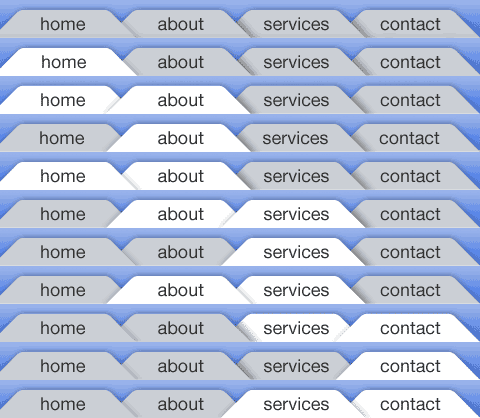
To combat cross browser and image flicker problems this method uses one image as a background which is positioned using CSS. Depending on how intricate your design is this can make your image quite large. You will need to make a decision on how many states you have as the more you have the larger your image will be. You need to make an image with a line for each state. Once you have saved the image keep it open and use guides to find out the pixels dimensions for your CSS. Here's the image I'm using. After playing with image optimisations I went for a png which works out at 12k.

All states of the rollover

Step 3 - The Markup

The XHTML is the classic unordered list navigation. This means it will be good for search engines and good for screen readers. This method makes use of an id on the body tag to define the on state so you will need to either hard code the body id on the pages or handle this with some server side code. Each li item also needs a unique id so the background can be positioned correctly.

<html>
<
body id="home-page">
        <
div id="nav">
            <
ul>
                <
li id="home"><a href="#">Home</a></li>
                <
li id="about"><a href="about/index.html">About</a></li>
                <
li id="services"><a href="services/index.html">Services</a></li>
                <
li id="contact"><a href="contact/index.html">Contact</a></li>
            </
ul>
        </
div>
</
body>
</
html

Step 4 - Positioning the navigation

Using the background-position property we position the image correctly for each list item. You need to be pixel perfect on this so this is where the guides or rulers and the marquee tool in Photoshop or Illustrator come in. You can measure the dimensions exactly and transfer it to the CSS. For the on states we position the tabs with a negative margin.

li#home a:link, li#home a:visited
    
{    
    background
-position: -0px -0px;
}

body
#home-page li#home a:link, body#home-page li#home a:visited
    
{    
    background
-position: -1px -38px;

Step 5 - Fixing IE6 & Below

IE6 and below have problems with interpreting negative margins on floated elements. To fix this we make the states where we need a hover absolutely positioned, and then apply a negative positioning. To make sure it shows on top z-index is used. This method works for IE5, 5.5 and 6. To keep things clean we put things in a sepearate stylesheet and serve this to older version of Internet Explorer using conditional comments. This also makes sure that IE7 gets served code that takes account improved CSS support.

body#about-page li#home a:hover,body#about-page li#home a:focus
    
{
    position
:absolute;
    
margin-left:-134px;
    
width:150px;
    
z-index:1;

Demo

You can see the code in action in the demo.

The source code is also available for download.

This code has been tested and works in the following browsers

The best way to understand this will be by downloading the code and going through this yourself. The code is made freely available under a Creative Commons 2.0 license. The code is provided as is and no support is implied or given.

Comments

Thame
Dec 9 2006

Very cool. We did something like that on the university at buffalo’s community engagement. We didn’t need so many states because the tabs didn’t project shadows in the design, but it was tricky nonetheless.

Here’s the sprite: http://www.buffalo.edu/community/images/main_navigation.gif

s1000
Dec 9 2006

Nice toturial.

Must say though, it’s been a few years since I’ve been able to create a website with a “static” navigation like this. I mean, this solution would take quite a lot of work to alter.
I’m familiar with the limitations, but a dynamic solution (text combined with graphics) would be handy.

On the other hand I could see it’s use to switch content specific details, tab-links that could be considered less dynamic.

Jessica
Dec 9 2006

Who wants to make 800 new images when they add a new tab? I suggest adding in some automation to dynamically generate the images. That way when you decide to move, rename, delete or add tabs you don’t spend hours redoing these graphics.

Jaack
Dec 10 2006

I think it’s a good tute, very cool way to do navigation on a static section/category based site.  A bit lengthy on the initial build of the graphics but I’d imagine an automated script in Fireworks may do the trick for ease of creation, however creating that script may take some time.

Chris Heilmann
Dec 10 2006

Nice use of CSS sprites and replacement here. However, it fails in basic usability: The current page should not link to itself (what for?), and relying on CSS to highlight a section is as bad as relying on JavaScript.
It would be good to see a version that highlights the current tab with a STRONG element instead of a link.

Lim Chee Aun
Dec 10 2006

Actually the image can be made even smaller in file size and dimension. You could actually combine the rows of states, for example row 5 with 6, row 8 with 9, row 4 with 10 and row 2 with 7. Then a little CSS to ‘reuse’ the states. :-D

akella
Dec 10 2006

Just reminded me this one
http://superfluousbanter.org/archives/2004/05/navigation-matrix/
May be separating the images for each navigation tab would be more efficient?

Will
Dec 10 2006

Couldn’t you create the tab images with blank images and then layer the tab text on top.  That would reduce the need to recreate the tab images everytime there was a redesign that reordered the tabs.

Torsten
Dec 11 2006

we did something similar last year. but instead of faking the overlap, we used css for real overlapping. a bit of negative margin here and z-index there and you’re finished.

take a look at http://immobilienfinder-leipzig.de

Chris Williams
Dec 11 2006

In agreement with the comment by “Will” above me - I created a virtually identical navigation last month and used just a blank navigation with all states.  By then including an extra <span> into the <li> <a>, you can add separate text graphics for each navigation item…

Carlos Eduardo de Souza
Dec 11 2006

Very cool! I’ll download it and then, try to do my own example.

Tortsen
Dec 12 2006

Tortsen, that’s a good idea, I hadn’t thought of z-index as a solution to this problem - I’m going to have to try something similar.  The solution provided here is just not flexible and provides little help to the visually impaired.

George Ornbo
Dec 13 2006

@s1000 - there is no reason why you couldn’t use text over the graphic here, meaning dynamic nav would be possible.
@Chris - fair point. If I get some time I’ll look at reworking this to avoid self referencing links.
@Will - you could indeed. This opens up preloading and image flicker issues though. Both of these are solvable of course.
@Torsten#2 - I don’t agree. This method is screen reader friendly so should be no problem to navigate. The tabs highlight on tabbing too. If you are talking about colour blindness then that is a separate issue.

royby
Dec 13 2006

great tute, very informative, but although i know a little about XHTML I’m really unsure about XTHML?? :-)
“assumes a good level of understanding of both CSS and XTHML.”

cheers

Rimantas
Dec 13 2006

And how exactly link to the current page hurts usability? If navigation clearly shows that this is your current page, link won’t do any harm.
I, as an user, often find them very handy when I want to reload current page (for example to see if there are any new comments, etc.)

!!blue
Dec 14 2006

This is wonderful! I could’ve use this oh so long ago.

I noticed that in Mozilla 1.7.13 the tabs do this very wierd thing where one tab’s hover state will float in a div window—with a scrollbar—off to the top right of the window! This happened when I clicked on ‘Services’ and then hovered over ‘About.’ Very strange behavior. I can email you a screenshot.

John Faulds
Dec 14 2006

With regards Christian’s point on current page and usability, while I agree that for the example, it’s probably unnecessary to link to the page you’re on, there are many instances where I think linking to the current page is actually more usable than not doing so. For forums or pages with rapidly changing content is it worse to have a link to the page you’re currently on so you can refresh and see the new contents, or have the user reach for the reload button in their browser (if they actually know there is one)?
I think the example suffers more from an accessibility point of view than usability in that due to using images for all the text, the text can’t be resized.

Daniel Ulczyk
Dec 14 2006

Excellent tutorial!
Regards from Argentina.

Steve
Dec 17 2006

Too much work for that little effect.

Overall, not that great.

Plus, if you had to edit the text, you would just go back, ending up having to change EVERY single image.

Hang
Dec 18 2006

We use Z-index layout design, and ensure the priority order of each order

Martin
Jan 1 2007

I’ve made something quite a bit simpler that uses z-index to popup and only uses 3 tab images (active, hovered and inactive).. check it out at:


http://anythingclose.com/css-overlapping-tabs.php

Simanto
Jan 28 2007

Martin, Your isn’t working

davidvogt
Feb 3 2007

Your article is very informative and helped me further.
Thanks, David

Wayne
Feb 21 2007

I used your menu system on our new website, with some slight modifications. Check it out let me know what you think. http://www.flairbartending.com

Rechtsanwalt Strafrecht
Apr 19 2007

Your article is very informative and helped me further.  Thanks a lot.

duluoz
Jun 21 2007

Wow. Amazing!

Matthias
Jul 8 2007

Yes, it’s well written and very informative. But the problem is, it’s too old, it’s not in time any more!

Mahavir
Jul 10 2007

you have provided a good tutorial and technique and in future i will apply the same on my home page at http://www.services.skillsheaven.com

Idetrorce
Dec 15 2007

very interesting, but I don’t agree with you
Idetrorce

Waqar Hussain
Jan 1 2008

Hey Dude.. Nice Info there… what if we are using Ajax Based Tabmenu.. like only 1 Body Tag…. Thats what I am trying to do since the last couple of days.. as the process is complex and hard to position the images.. but for Overlapping tab menu with Icons I cant see any other way round… anyone has some good idea to use overlapping menu with Icons means Each Tab has different Image or the same image with Positioned…. ??

shine
Jan 22 2008

Good and informative! but not useful for me

logistics
Jan 22 2008

Your article is very informative and helped me for further detailed.

carego
Apr 3 2008

Wow it is wonderful and helpful

Dan Shields
Apr 20 2008

few years later and still helpful for people who have never done overlapping tabs. Although my challenge was different than yours it helped plan out how to set up my giant image. Thanks!

Jayce
Jun 28 2008

Nice. Thanks for the tips. :D

Mr. Ecommerce
Aug 22 2008

Very good template menu!, i’am used!

graphic organiser
Sep 13 2008

awesome stuff, i am an infant in the world of CSS but i can still vouch for the excellence of this code. amazing stuff. Kudos.

Adeel
Sep 16 2008

It’s a good practice to learn the css for overlapping tab menu but it creates a problem when page is not refreshed on the internet explorer but it works on firefox perfectly. Please suggest any solution for the menu that I created. Thanks in advance.

Soh
Dec 30 2008

Nice! I tried coming up with this technique but got frustrated once I realized how many versions of the tabs I had to make X-p

Nice to see that you went through with it though, thanks!!!

sivas
Feb 14 2009

very good, thanks..

Great…

D_E_R_M_A_N
Feb 14 2009

thanks ........................................................

Comments on this post are now closed.

Post details

9th December 2006

41 Comments

What's this?

This is a journal entry written by George Ornbo, a web designer who lives and works in London, England.

Subscribe

Journal articles by RSS

Journal articles by Email

Recommended Links by RSS

Member of the 9 Rules Network Slicehost