Creating usable forms
Forms are often overlooked from a design perspective, resulting in frustrated users. With a bit of CSS and minimal effort you can easily make your forms more usable.
Forms are too often overlooked 
Forms are an extrememly important part of a website. They are the pages where users pay for goods, submit comments and contribute to site content. In short this is where the user does something rather than click around. If users can’t complete forms quickly and easily they will leave the site and you will lose business.
Forms deserve design 
On many projects a design will be completed for the homempage and an internal screen but not for forms. This is a huge oversight. Forms need to be designed carefully to ensure they are usable and guide users through a process. Often forms are constructed by the development team with no thought being given to the user experience until things go wrong.
A good start - let text breathe 
Too many forms use the default styling for input boxes. This crushes the text up against the edges of the box. With a little CSS you can give the text padding from the edge of the input box. This makes the text easier to read, resulting in less user error.
Until CSS3 arrives you will need to define a class for each input type. I like to match this to the type. So for input type=“text” I have:
input.text {
  padding: 5px;
  border: 1px solid #999999;
}

This would seem a very simple thing, but in my opinion it instantly makes forms more usable.
Keep the blinkers on 
Once users have started using a form it is important that they complete the process. For this reason it is advisable to strip down the site as much as possible to just the form. Offering users promotions and shiny buttons is likely to distract them and move them away from concentrating on the form.
Tell users where they are 
Forms are boring. There is no getting round it. Telling users where they are in the process shows them light at the end of the tunnel but also keeps them focussed. If your form has three stages use a graphic to show them where they are. The form should also allow users to go back and change details in previous stages. Using sessions or cookies will increase development time but it is well worth it.

Handling user error 
Humans are not robots so they are going to make mistakes. Blaming the user for their errors is just not acceptable. Forms should limit user error by design. Secondly they should allow users to recover quickly from errors. This is crucial as users leave sites if they become frustrated.
When a user makes a mistake ensure that the screen clearly shows the areas they need to correct. You can do this server side or with Javascript, but if you do use Javascript ensure that it degrades well for users with older browsers or Javascript turned off.
It still amazes me that many large sites don’t capture correctly submitted information when there is an error. If you are using server-side validation make sure you remember the information once the user has submitted the form.
CSS is really underused on forms for showing users where they have gone wrong. You can use server side scripting or Javascript to switch a class and instantly show the user what they need to correct.
Have a look at the demo for one way of styling a form to make it more usable
Colour theory and warning messages 
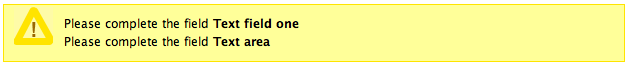
I have never really understood why the colour red is traditional in warning messages to users. I have seen many instances where users react to red by panicking especially if they have entered credit card details. Compare this to the traditional use of red in traffic lights - it means stop or you will be in extreme danger. Is this the kind of message we want to send to users? I prefer amber to show the user they have made an mistake but that they are not about to meet an untimely end.
Show success and plan for change 
Once a user has completed a process make sure there is a message saying that the information has been submitted successfully. Send the user an email with at least a summary of the information they have submitted. It is very likely that the user may want to change some or all of this information at some stage. Plan for this when you design your system and you will save time and money down the line.
Don’t agree? 
Leave a comment and join the form fun!
Tags
Can you help make this article better? You can edit it here and send me a pull request.
See Also
-
DOM + CSS = A beautiful couple
Understanding how the DOM works and using it in your CSS can help produce mean, lean code. Here's a quick overview of how it works. -
Web users are bigger than egos
Placing users at the centre of the design process is imperative for a usable website. Leave your ego at the door and find out what matters in creating usable websites. -
Overlapping tabbed navigation in CSS
A tutorial showing how overlapping tabbed navigation is possible in CSS and can be cross-browser compatible, accessible and javascript free.