Curved boxes in CSS
Curved boxes are straight forward to do in CSS. Here's a quick tutorial of how to achieve curved boxes in CSS and what's to come in CSS 3.
What we want to achieve 
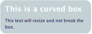
Here’s a graphic of the final product - a box with curved edges that will expand if the text is enlarged.
To start with we will make the graphics in Photoshop.
Curved boxes - Making the graphics 
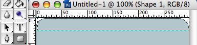
Open Photoshop and choose the rounded rectangle tool (shortcut of U on the keyboard). Decide on the size and colour of your rectangle and then draw a rectangle. You can make the curve bigger or smaller by changing the size of the radius.
Cut the curve out just below the last pixel of the curve. You can make the bottom curve quickly and easily by going to Image > Rotate Canvas > 180 º CW
The markup 
In order to create a cross-browser friendly box we need to attach the image to HTML elements. This method requires at least two elements inside the div. In this case we use the h2 and p tags and apply a background image to each through the CSS.
Our markup looks like this
<div class="curved-box">
  <h2>This is a curved box</h2>
  <p>This text will resize and not break the box.</p>
</div>
Applying the CSS 
We add the curves through the CSS by accessing the elements and applying a background image. The top one is applied to the h2 and the bottom to the p tag. Make sure the background to the div is the same colour too.
.curved-box {
  width: 298px;
  margin: 10px;
  background-color: #c3d0d4;
}

.curved-box h2 {
  background: #c3d0d4 url(../images/curve_top.png) no-repeat left top;
  color: #f4fbfd;
  padding: 10px 15px 5px 15px;
}

.curved-box p {
  background: #c3d0d4 url(../images/curve_bottom.png) no-repeat left bottom;
  margin: 0px;
  padding: 5px 15px 10px 15px;
  text-align: left;
}
Using this code the text will resize without breaking the box.
Have a look at the code in action in the example.
Browser support: IE5+, Netscape 6+, Firefox 1+, Safari 1+, Opera 7+, Flock, Camino
CSS3 will make it even easier 
Once CSS3 is finally agreed it will be even easier to curve the edges of boxes. “Border-radius” will curve the corner of the box. For now browser support is not great and indeed browsers have their own proprietary properties:
-webkit-border-radius: 10px; /* Safari prototype */
-moz-border-radius: 10px; /* Gecko browsers */
border-radius: 10px; /* Everything else - limited support at the moment */
Currently supported in Camino 1+, Firefox 1+, NOT IE. The code degrades gracefully so if it is not supported there will be no curves but it will still render. Check out the example to see it in action.
Tags
Can you help make this article better? You can edit it here and send me a pull request.
See Also
-
Contact details in one click
At some stage everyone has laboriously copied and pasted contact details from a website into their address book. Wouldn't it be nice if you could just click a graphic and see the details turn up in your address book? -
Firebug is simply brilliant
Software comes and goes and rarely is there a piece of 'must have' software. Firebug, an extension for Firefox, deserves to be to be heralded as an outstanding piece of software and something no web developer should be without. -
Writing good XHTML and CSS Part 2
The second in a series of good practices for writing XHTML and CSS looking at writing clean, maintainable code and dealing with browser hell problems.